Fig & Tyler
VISUAL IDENTITY - BRANDING - LOGO design - iconography - IMAGERY - WEBSITE DESIGN - PACKAGING - ADVERTISINGProject Brief
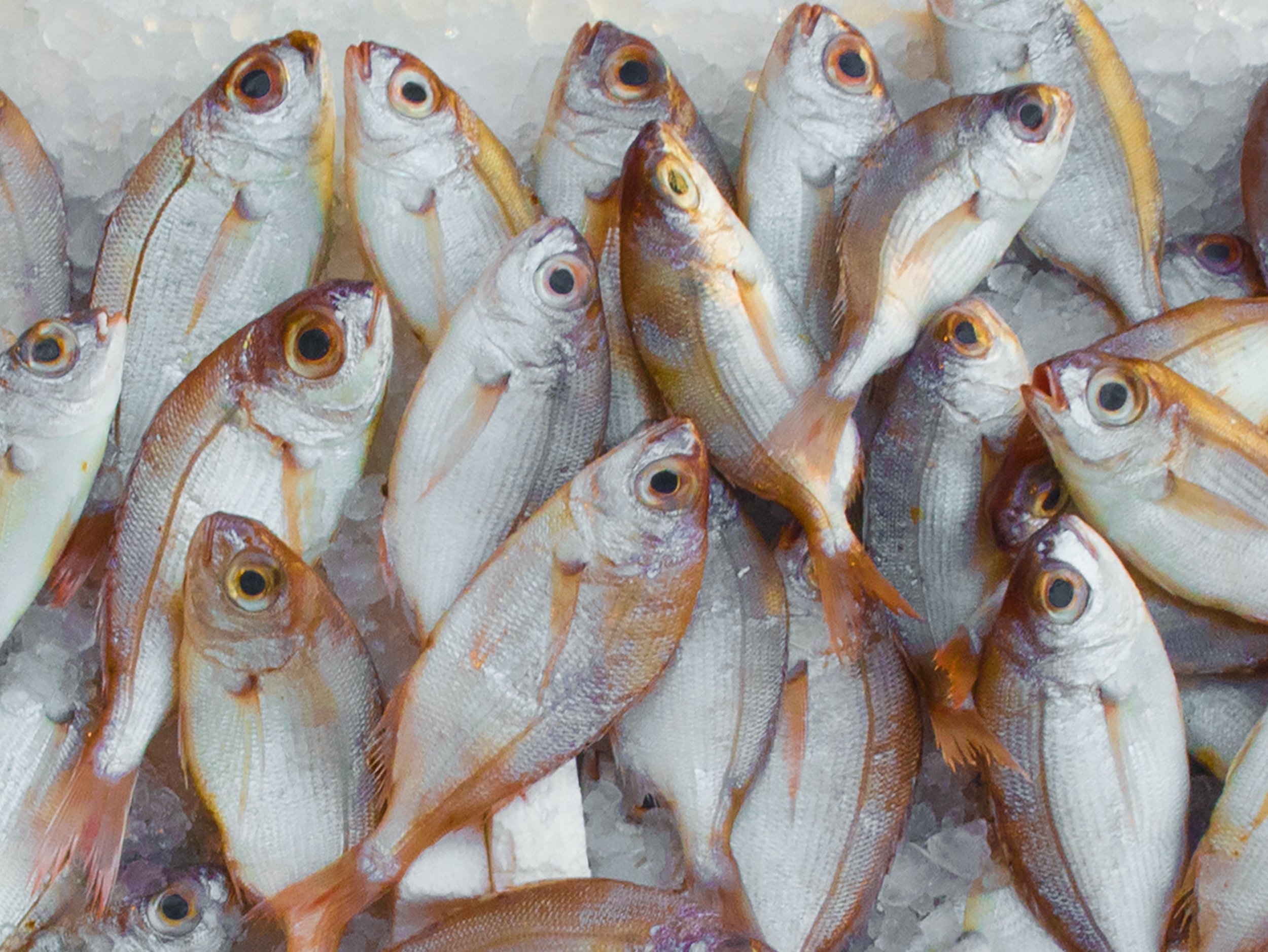
Experimental project to redesign an existing brand’s visual identity. Fig and Tyler is a direct to consumer, high-end, specialty pet treat small business. They freeze dry their products so that they can skip the unhealthy fillers and preservatives that overwhelm the pet treat market. They source all of our ingredients from US farmers that they know and trust, to give their customers ownership of their pet’s diet. Fig and Tyler understands the importance of choice, that’s why they provide 7+ protein options including novel proteins like rabbit and bison.
Design Objective
My goal for this project was to reimagine their branding with an approach to appeal to modern pet owners who value high quality treats and the ingredient transparency. From designing a new logo, to carefully picking out the 7 colors that would represent each individual protein, I gave their brand an entirely new look and feel.

Brand Positioning
-
PRIMARY
The modern pet owners who value high quality treats and the ingredient transparency. They care about the health and nutrition of their pets and want to know exactly what they are feeding their dogs. They are the same people who care to buy higher quality ingredients for themselves, they are concerned about processed foods and chemical preservatives because of their negative health impact. They are people who think of their pets as their family, so they are willing to spend more money.
SECONDARY
Dog trainers that need high value treats that will also be high motivators to their dogs. They value high quality ingredients as the health of the dogs is the highest importance to support their performance. Fig and Tyler offers training morsel size treats to meet the needs of this specific customer.
TERTIARY
Those who have pets with protein allergies who need to avoid specific kinds of meats. Fig and Tyler offers a wide variety of proteins including novel proteins and single ingredient options. These customers are especially interested in the transparency of ingredients that Fig and Tyler offers because of the nature of their pet’s condition.
-
Fig and Tyler is a direct to consumer, high-end, specialty pet treat small business. We freeze dry our products so that we can skip the unhealthy fillers and preservatives that overwhelm the pet treat market. We source all of our ingredients from US farmers that we know and trust to give our customers ownership of their pet’s diet. Fig and Tyler understands the importance of choice, that’s why we provide 7+ protein options including novel proteins like rabbit and bison.
-
Fig and Tyler is a brand that pet parents can truly trust. We offer the highest quality product for dogs and cats that they will love.
-
Fig and Tyler provides passionate and informed pet owners with high-quality, healthy treats that their pets love. The ingredient lists are short and recognizable so they can feel good about what they are feeding their best friend. With all of the protein options to choose from, there is something for everyone.

Logo

Color

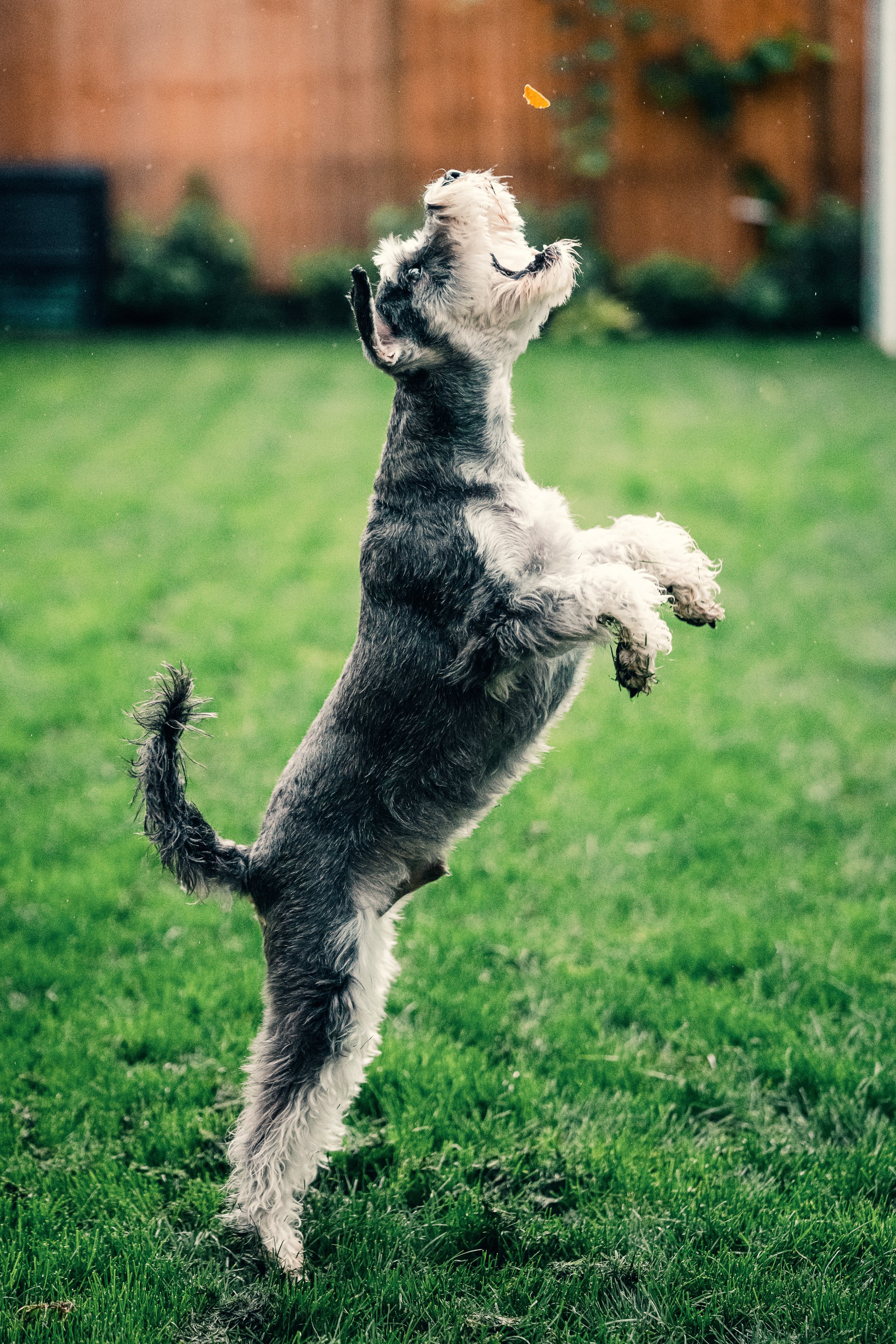
Imagery
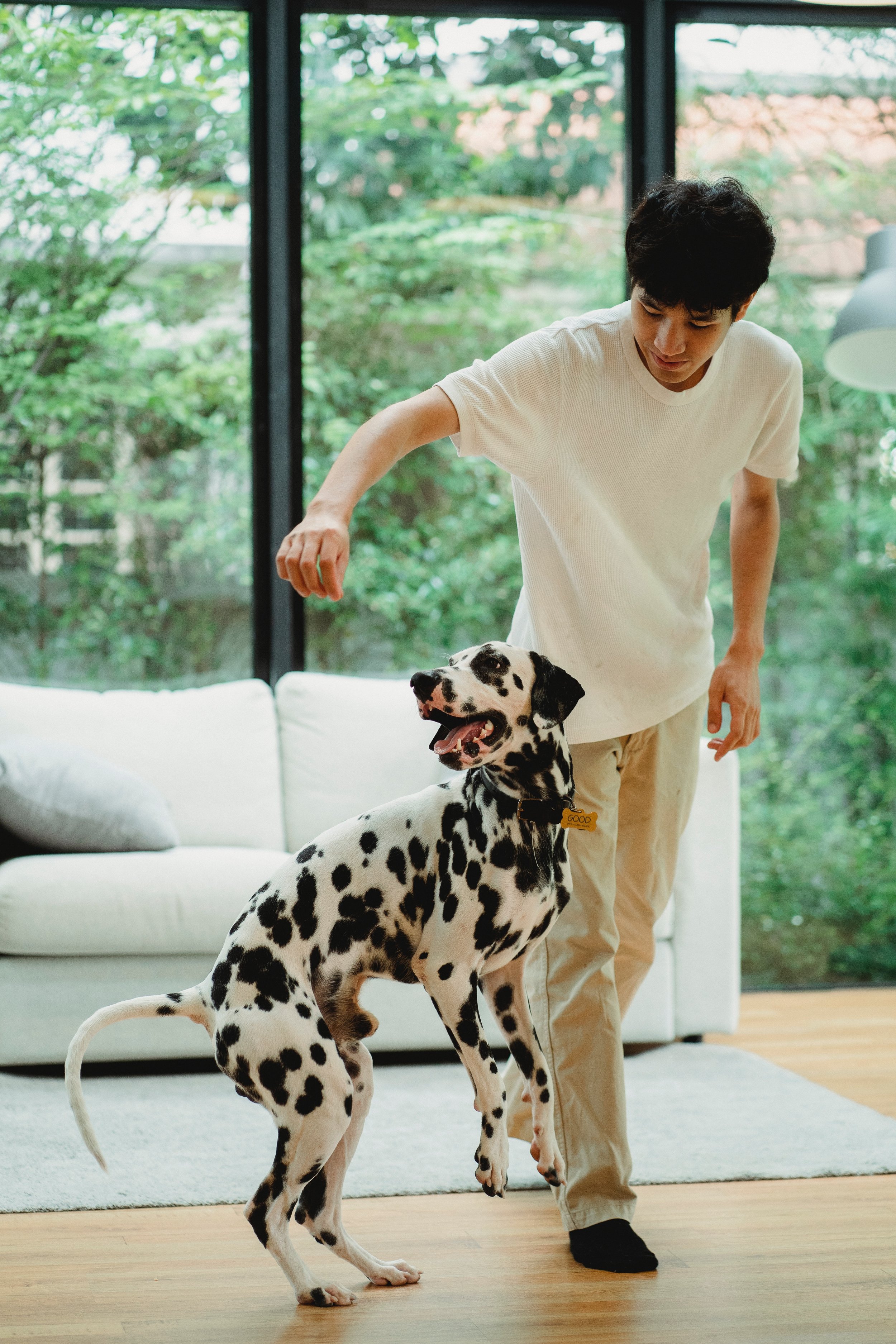
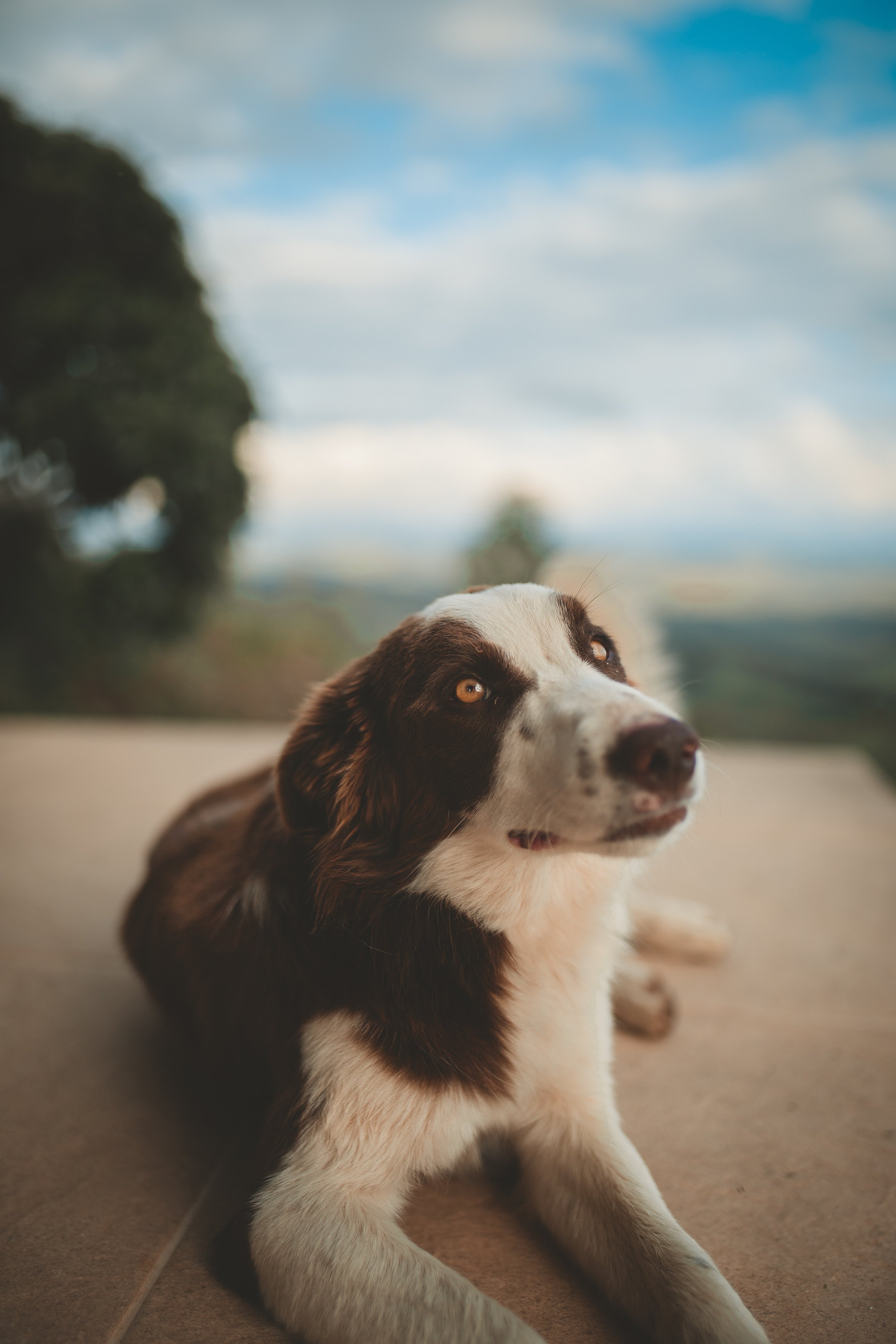
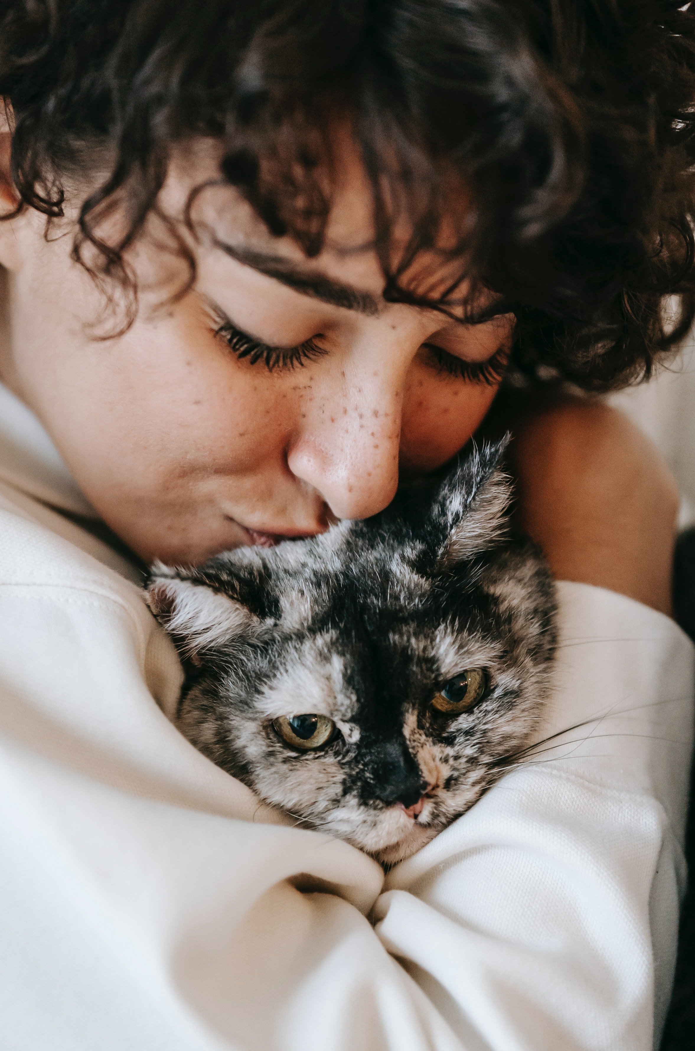
The Photographic style adheres to our brand pillars of trustworthy, fresh, and healthy. Scenes should be friendly, people embracing or interacting with their pets, and show high quality fresh ingredients. Colors should be rich, moderate contrast and mimic our color palette.


Iconography
Packaging


Advertising


Website
